Microsoft To Give Windows Start Menu A Refreshed Look
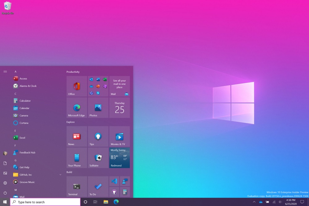
Microsoft is going to give its Windows Start Menu a slight makeover, with the change rolling out now for Insiders. It’s not a major one, with the most obvious change being the removing of solid colours in the apps’ back plates.
The removal of the solid back plates will make them look better when you switch Windows to its dark theme. Or any other coloured theme for that matter, as Microsoft demonstrates on its blog. The Start menu looks a lot cleaner and more uniform as a result.

In addition to this cosmetic change, the company is also testing some thing else with the Alt+F4 funciton. Rather than just letting you switch between windows, the company wants to put each tab of Microsoft Edge here as well. Which could go either way, depending on your preference. It’s something that Google tried with its mobile OS Android, and its browser Chrome.
No word yet on when these changes will be making their way to the general Windows Update release. These will first go to the insiders in the Dev Channel first. Hopefully Microsoft doesn’t decide to make the Alt+F4 changes mandatory, and allow users to choice of turning it on or off.
(Source: Microsoft. Image: Engadget)
The post Microsoft To Give Windows Start Menu A Refreshed Look appeared first on Lowyat.NET.
from Lowyat.NET https://ift.tt/2VG69VL
Labels: Lowyat
0 Comments:
Post a Comment
Subscribe to Post Comments [Atom]
<< Home