Small Google Messages beta update adds full-width search bar

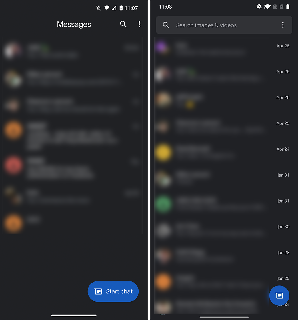
Google Messages is getting yet another small update. This time around, the change adds a search bar to the top of the app, replacing the old ‘Messages’ title and search button.
The search bar brings Messages in line with many other Google apps. It spans the top of the app and contains the app’s name, just like Photos, Gmail, Drive and Keep. Also like those apps, Messages features an animation in the title bar that first shows the app title before transitioning into text that reads ‘Search images & videos.’

Functionally, it appears that nothing is significantly different. Instead of tapping a magnifying glass to search, users can now tap the search box. Searching still yields contacts, messages, photos and videos.
Android Police reports that the new search bar is rolling out as part of the Messages Beta in version 6.2. However, there’s likely a server-side component with it as well. I tested several devices running the 6.2 beta but only one had the new search bar.

Left: Messages’ current design. Right: New Messages with search bar.
If you want to join the beta and try out the change for yourself, it’s easy to enroll in the Messages Beta through the Play Store. Just head to the Messages store page and scroll to the beta section. It should be as simple as tapping the ‘enroll’ option and waiting for the Play Store to push out the latest beta update for your phone.
Alternatively, you can try downloading an APK of the beta from a third-party source — if you’re aware of and comfortable with the risks involved. However, since there appears to be a server-side component to the update, you may not get the new search bar even if you install the 6.2 beta app.
Source: Android Police
The post Small Google Messages beta update adds full-width search bar appeared first on MobileSyrup.
from MobileSyrup https://ift.tt/3eS4aok
Labels: MobileSyrup
0 Comments:
Post a Comment
Subscribe to Post Comments [Atom]
<< Home