OnePlus 8 Hands On: An All Too Familiar Design
The OnePlus 8 series has been out in the wild for nearly a month now and suffice to say, there’s a fair bit to talk about the two. This time around, both the OnePlus 8 and OnePlus 8 look identical at a glance, their difference in sizes and main cameras notwithstanding.
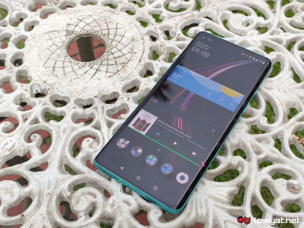
I’ve been given the chance to take the non-Pro version of OnePlus’ latest flagship for a spin. And while there is a fair bit to shout about, I cannot deny that there’s a very familiar allure to the OnePlus 8.
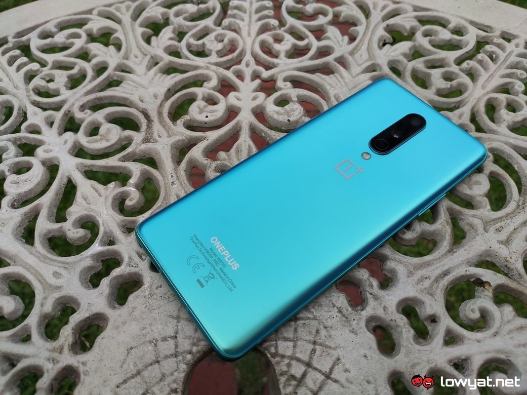
We begin with the one factor that really makes the OnePlus 8 pop out: the colour options. To be frank, I am a little disappointed that I didn’t receive the Interstellar Glow colour option; the cascading and bright shifting colour scheme of orange, pink and purple is absolutely striking. Of course, I’m not saying that the Glacial Green colour scheme I hold in my hand at this moment is hideous by any measure of the definition. But merely a personal preference.
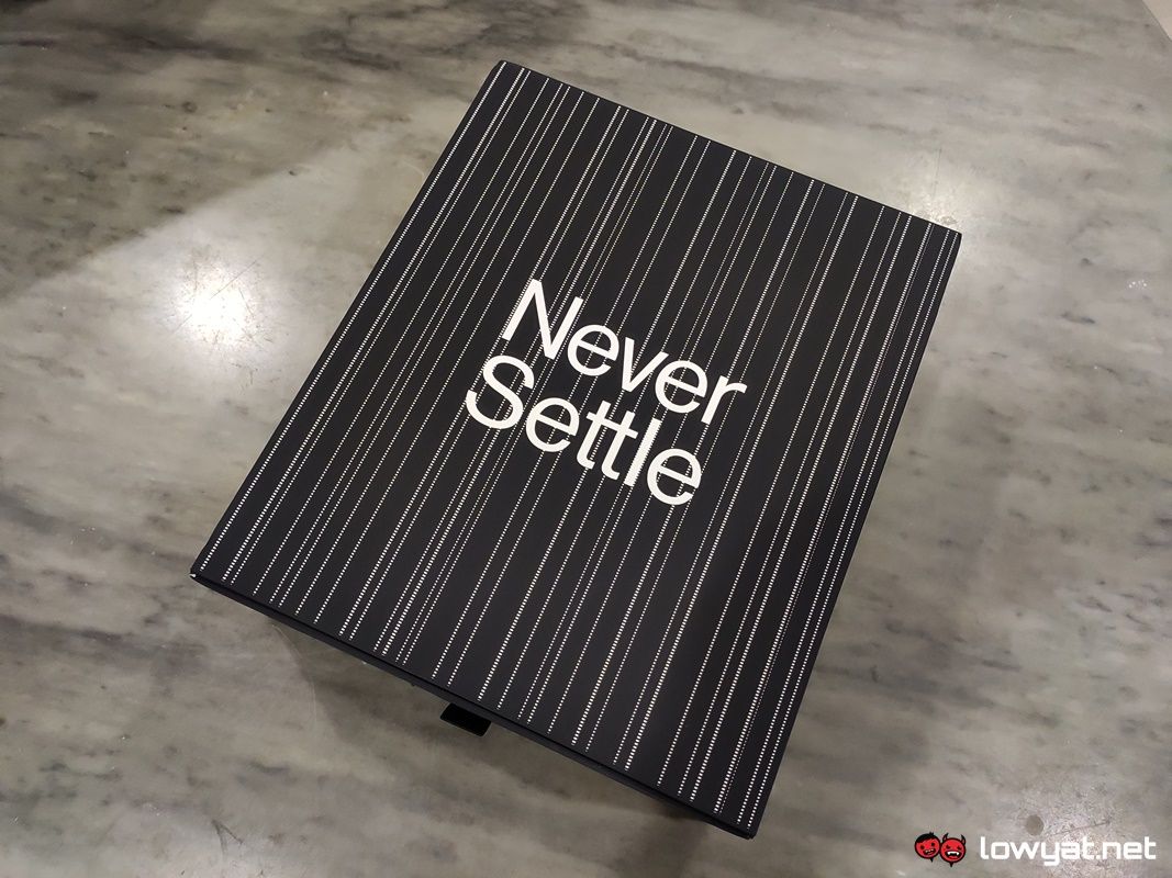
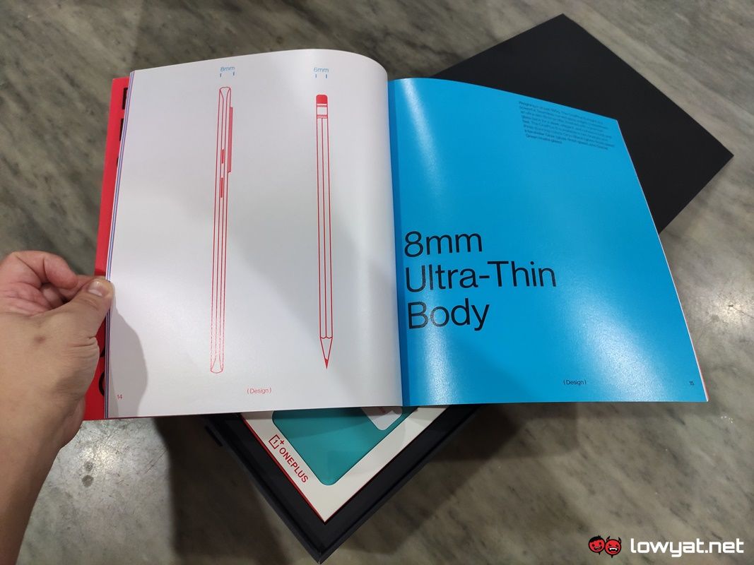
On a side note, there’s also the packaging of the OnePlus 8. It is one of the most extravagant I’ve seen for a OnePlus device, but also probably the most well-deserved. The contents of the box are generous; as you unravel the packaging, you’re first greeted by a bright red book that is actually a detailed account of both the phone’s design and the hardware within.
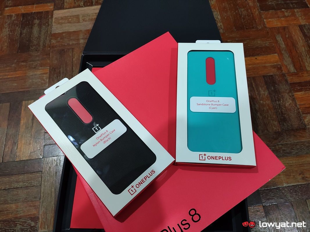
Naturally, the OnePlus 8 is also there; in this instance, the phone itself is self-contained within its own packaging that is also bright red in colour. The package also comes with two phone cases: The first is the Cyan Sandstone casing that harkens back to the material OnePlus exhibited with its first flagship. The second casing is a black nylon, textured bumper case.
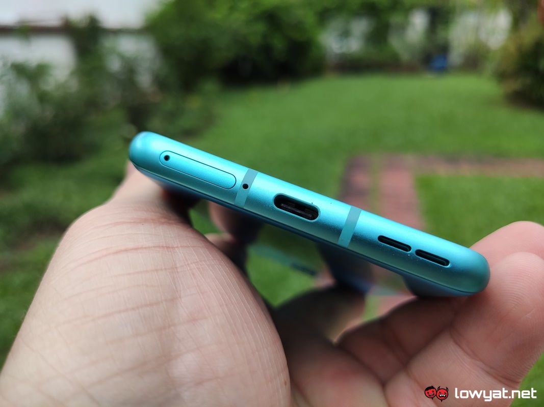
Now that that’s out of the way, let’s talk about the main character: the OnePlus 8 itself. Just like the OnePlus 8 Pro, as well as most rival flagships, it’s rocking Qualcomm’s Snapdragon 865 chipset and depending on what you’re looking for, you’ve got you have a choice between 8GB and 12GB of LPDDR4X RAM. Both being exceedingly healthy amounts of memory to help keep the phone jogging through your typical tasks without ever showing any signs of slowing down.
There’s also the display of the OnePlus 8, which is a 6.55-inch Fluid AMOLED panel, with Full HD+ resolution. Moreover, the display has a maximum refresh rate of 90Hz that can be selected within the phone’s settings. It also a punch hole display, but rather than place it dead centre at the forehead, OnePlus has decidedly chosen to push the 16MP selfie camera’s housing to the left.
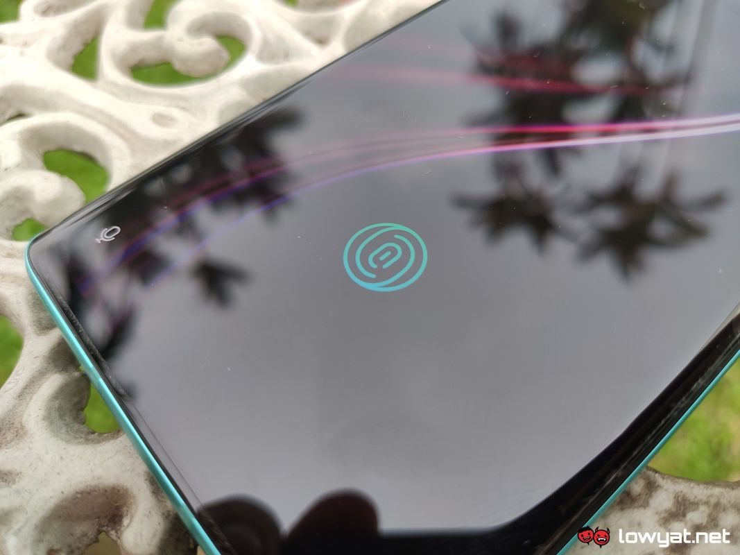
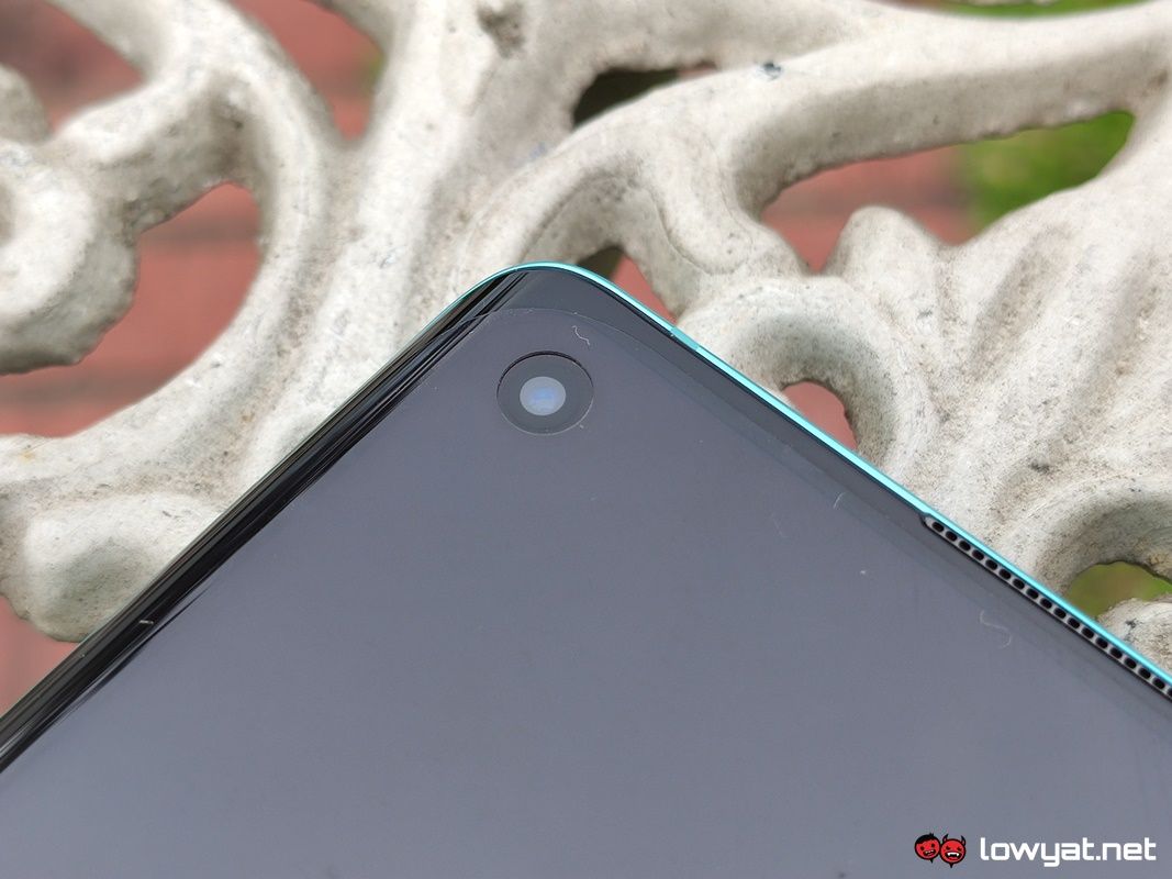
Now, I’m not a fan of punch hole display, but I do tolerate them to a varying degree. In the case of the OnePlus 8’s punch hole, my personal gripe is that OnePlus didn’t even push it all the way to the edge. Worst still, it’s also not situated as close to the top bezel as most selfie cameras are. Honestly, it gives a very “off-centre” sort of vibe, and notifications that appear next to it look ajar.
Moving on, there’s also the main triple-camera system of the OnePlus 8. Sure, it has a 48MP sensor as its main shooter. The problem with this scenario, however, is that it’s a Sony IMX586 sensor that was introduced last year, and not Sony’s more recent IMX689 module.
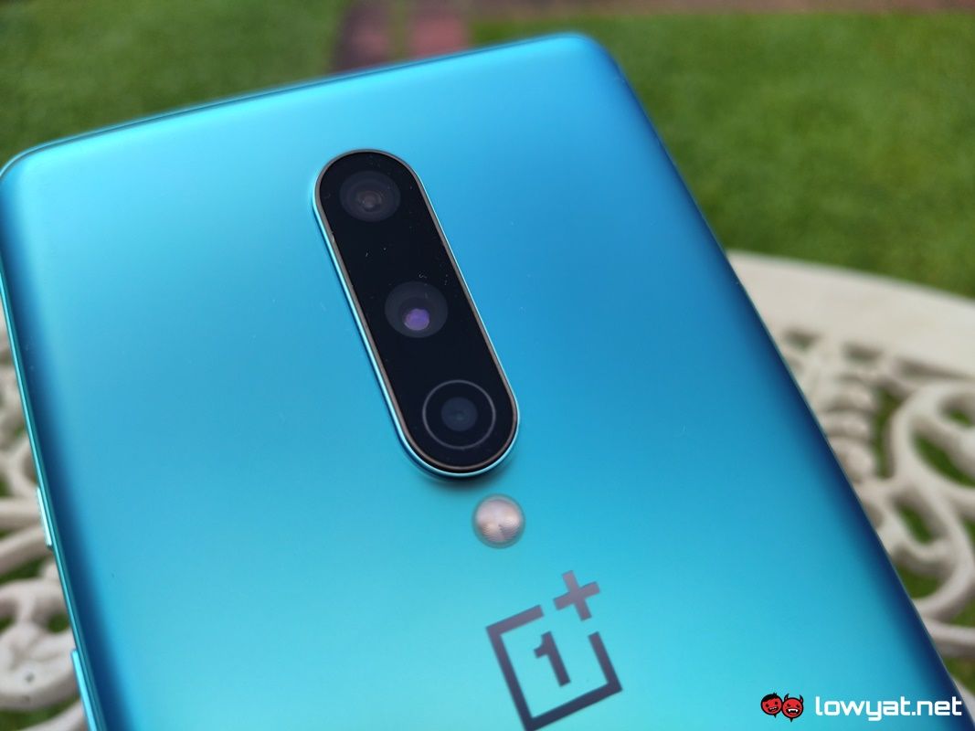
While my experience with the OnePlus 8 and its main camera is still ongoing, I can safely tell you that there are some notable differences in the camera software. Compared to what I experienced with the OnePlus 7 Pro last year.
Firstly, OnePlus seems to have listened to the fans and finally provides an option to switch between using the full 48MP or 12MP. The latter pixel option seems odd, considering that the other sensors comprise a 16MP ultra-wide and a 2MP macro sensor. Unsurprisingly, snapping photos at 48MP disables the phone’s zoom function, but the list of imaging oddities doesn’t stop there.


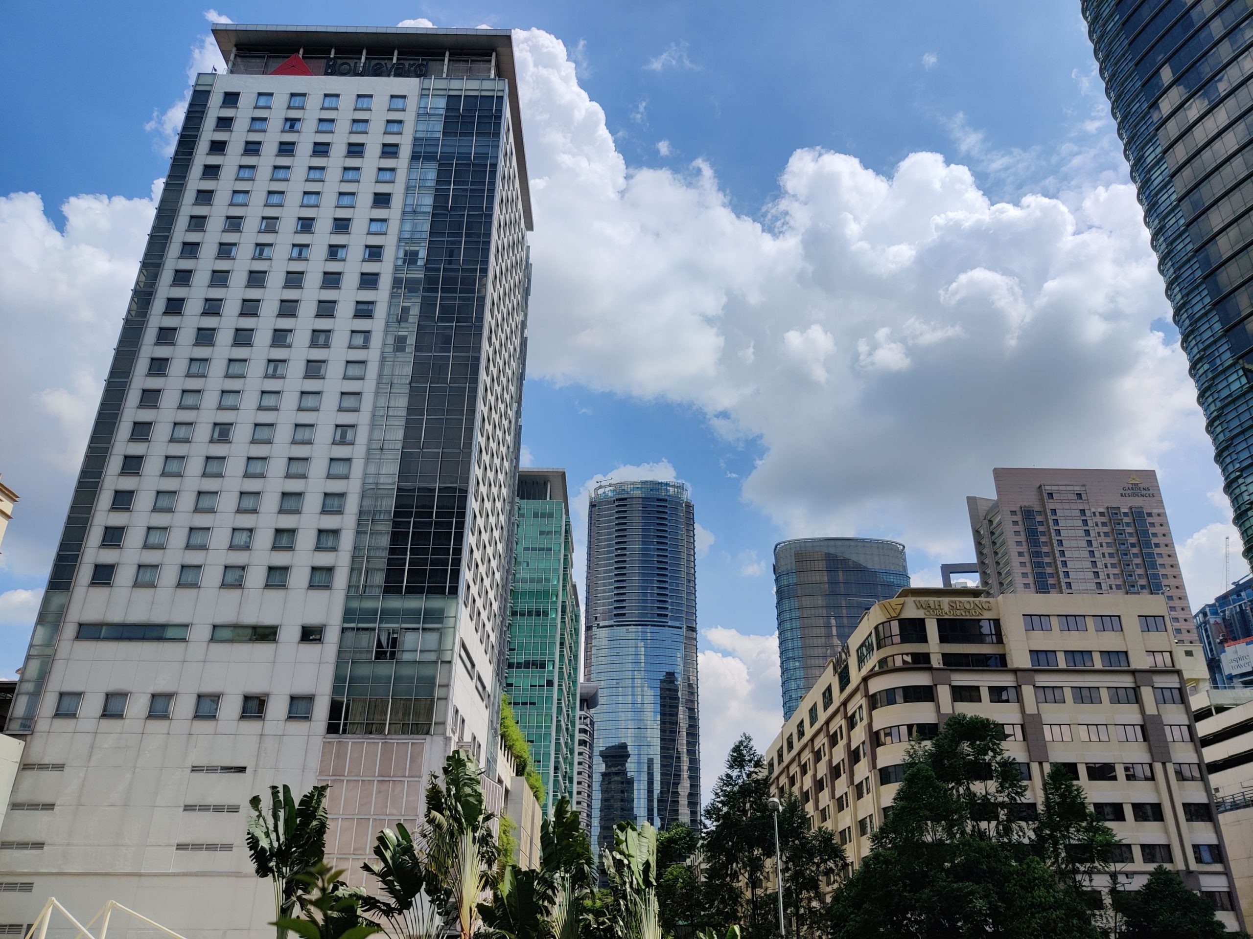

Choosing between 12MP and 48MP comes its own set of caveats, and OnePlus makes it a point to remind you of that. Every time you switch between the two resolutions. Snapping photos at 12MP with the phone is still impressive, and even has far superior HDR. However, switching over to 48MP means that you forfeit that HDR in favour of the higher resolution and more detailed photos. Of course, none of it detracts from the fact that the phone is still a very capable shooter.
It goes without saying that further testing will need to be conducted before I can compose my final thoughts on the phone. Until then, stay tuned.
The post OnePlus 8 Hands On: An All Too Familiar Design appeared first on Lowyat.NET.
from Lowyat.NET https://ift.tt/3baTor6
Labels: Lowyat
0 Comments:
Post a Comment
Subscribe to Post Comments [Atom]
<< Home