Twobird is an excellent looking email app that’s on the verge of greatness [App of the Week]

Finding the perfect email app can be a challenge, but Twobird from the makers of Notability might just be able to solve this problem with its clean design and multi-platform nature.
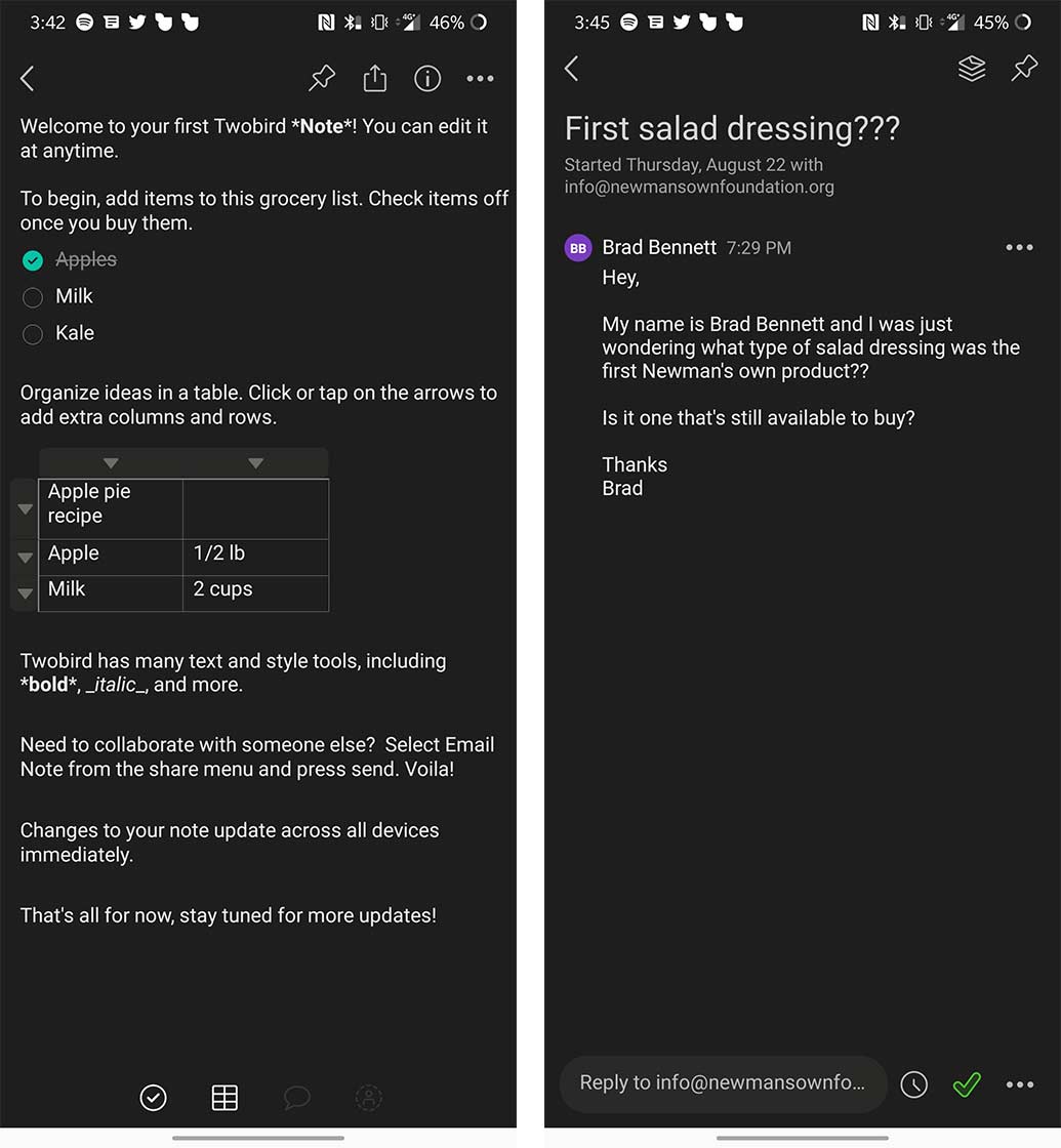
The app is a relatively simple email client that also has a notes section built into it — hence the name Twobird.
Where it excels

The best thing about Twobird is that it’s available to download on Mac, Windows, Android and iOS. While this might not matter to every user, people who use two or three of these devices will know how much more comfortable having the same experience across several platforms is.
Building off of that, it features the same expert design on each version of the app too. This includes pops of colour, light and dark modes and a simple layout that is easy to understand.
The app also does a good job of sorting emails into high and low priority inboxes.
On the tools side of things, you can set Twobird to remind you of an email later, create a link to an email so you can easily share it and there’s also a ‘pinning’ option. Even though there isn’t a lot of tools, the functions that are offered are all things that I use often, and the lack of overwhelming options helps keep your inbox simple to use.
The ‘Notes’ section of the app is also simple and only features the bare necessity when it comes to writing tools. Users can use ‘#’ beside words to turn them into headings, add checkboxes and tables plus a few other text formatting options for bold, italics and strikethrough. You can even set the app to remind you of notes later making it function like a reminder app.
You can also invite other users to collaborate on your note even if they don’t have the app.
What’s holding it back

While the main inbox layout is spectacular, there are some flaws. Reading a thread of emails can be a chore since they often get disorganized if people have long signatures. On top of this, the font sizes in the body text and the email headers are often close in size resulting in ill-defined spacing bad confusing layouts.
It also nests emails like older clients, which is a bit annoying. This means that as you scroll through a thread, you’ll see previously sent and received emails often. I much prefer how Gmail and some other mail apps sort emails.
There’s also nowhere to add an email signature of your own, so you have to type it out every time you send an email.
Even though the app has several problems, it’s still in early access so I can hope that a lot of these features get worked out as the developers spend more time refining Twobird.
The strength of the app’s design and its high and low-priority inboxes was what drew me to it in the first place, but until it adds in signatures and a less confusing email reading experience, I’m not sure I can commit to it as my main email app.
If you’re someone who doesn’t use a ton of email this app could be perfect for you since most of its main interface is really simple and well thought out.
You can download Twobird for free on desktop from the company’s website and on iOS and Android for free as well.
The post Twobird is an excellent looking email app that’s on the verge of greatness [App of the Week] appeared first on MobileSyrup.
from MobileSyrup https://ift.tt/2oqOKTl
Labels: MobileSyrup
0 Comments:
Post a Comment
Subscribe to Post Comments [Atom]
<< Home