Turn ‘to-dos’ into ‘dones’ with Microsoft’s stylish To Do app [App of the Week]

To-do list apps are nearly a dime-a-dozen these days and it can be almost impossible to find one that integrates well with your work style.
In the last year or so, I’ve bounced between apps like Google Tasks and Todoist, but neither quite met the needs I had. Tasks looked excellent and integrated well with other Google services I used but was incredibly barebones.
I switched to Todoist because I use the Newton email client, and it let me push emails to my to-do list with ease. However, to unlock some of the more useful features, Todoist asked for a premium subscription that was just a bit more than I was willing to pay. Plus, I seldom actually turned my emails into to-do tasks.
About two weeks ago, I started using Microsoft To Do after writing about its visual refresh. It straddled a middle-line between Todoist and Tasks, sporting a clean look and many features, albeit not as many as Todoist.
Stylish and functional

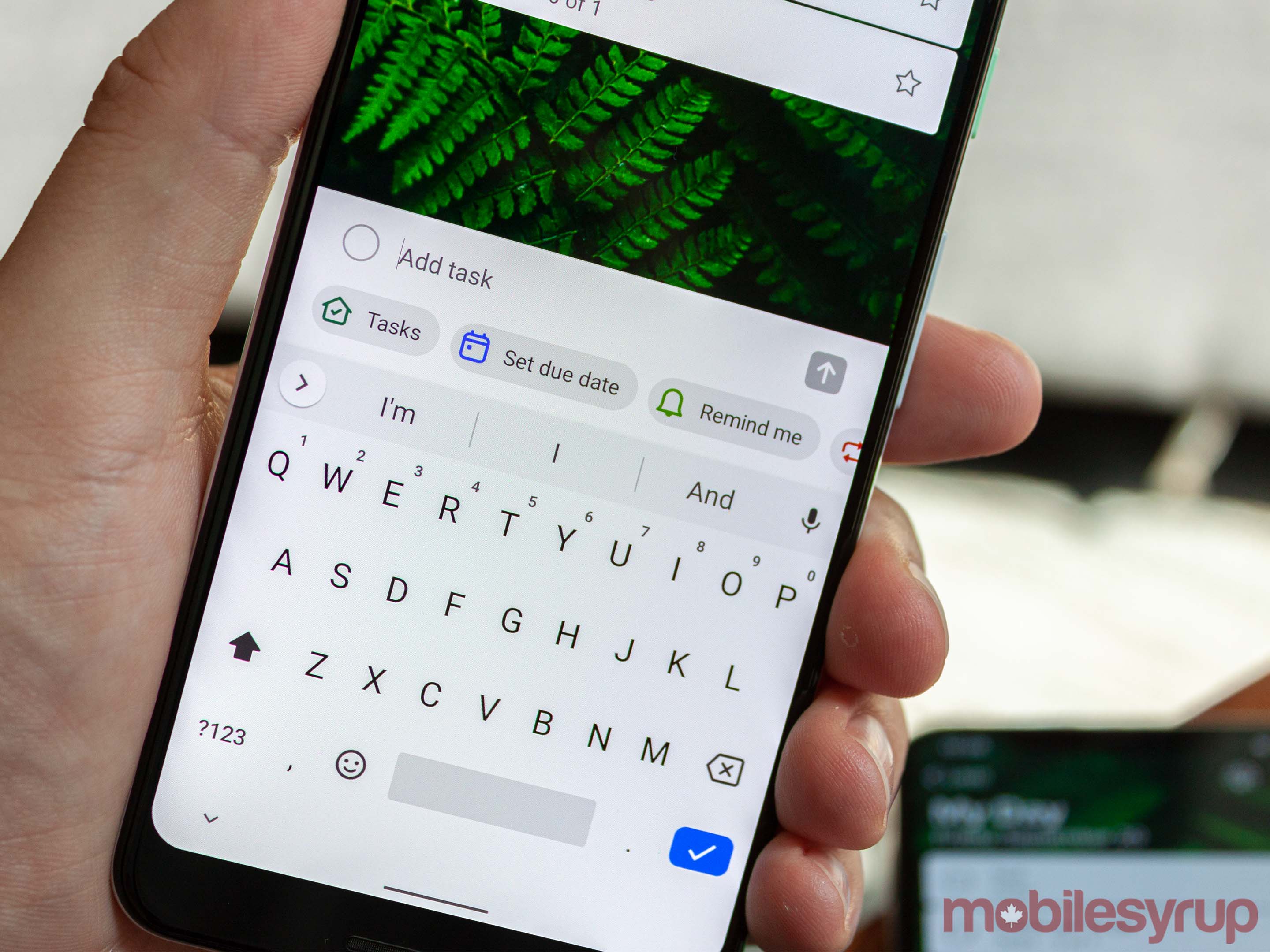
First up, let’s talk about looks. To Do offers a simple yet elegant design. Users can pick between several themes, including background photos and solid colours. Regardless of theme, to-dos take the form of a small white card which features the task, which category it’s from (more on this later) and the due date if applicable. Users can also star important tasks. At the bottom of the app is an option to add tasks.
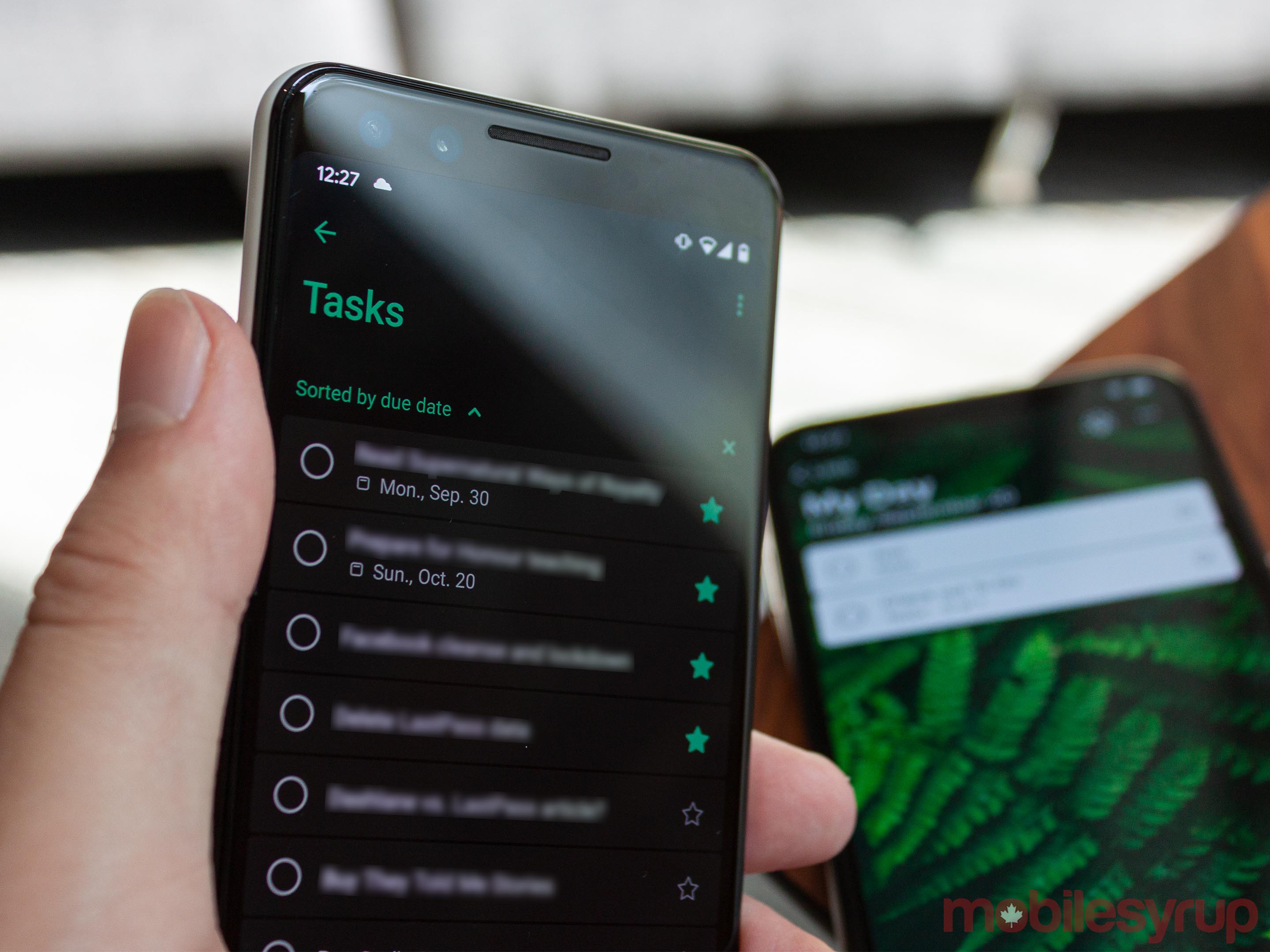
And, of course, To Do offers dark mode. However, it’s not available on every platform yet — it’s coming to iOS in a future update. Dark mode is available in the Android app, but unfortunately, it doesn’t support Android 10’s system dark mode toggle (you have to turn it on manually).
While the appearance drew me to To Do initially, what kept me on board was how the app handles tasks. Everything revolves around the ‘My Day’ page, and the app wants users to plan out which to-dos they want to get done each day.
You can create other pages and categories to sort your tasks. For example, I’ve got a page for all my starred items and ‘Planned’ tasks that have an assigned due date. There’s also a general list of every to-do I add. Finally, I made a custom ‘Work’ page specifically for tasks related to my job.
Any and all of these tasks can be temporarily added to ‘My Day’ to help keep you focussed on what needs to get done. Additionally, you can set up To Do to surface reminders each morning to set up this section of the app. For me, it’s a handy way to keep organized.
Stay focussed across all your devices

Tapping the reminder pulls up a list of my tasks. At the top are things I didn’t get done from the day before, followed by items with due dates that are coming up soon and then ‘Suggested’ tasks from my list. This list operates differently on iOS than on other platforms, but fundamentally it accomplishes the same goal.
Finally, one of the best aspects of Microsoft’s To Do app is that it’s available on nearly everything. There’s an app on Android, iOS, Windows and macOS. Additionally, it’s free and syncs across all platforms — I found the sync to be quite good. The desktop app would update within seconds of making a change on mobile.
It’s also worth noting that Wunderlist users can import their lists and tasks into To Do through an option in the settings menu. Microsoft purchased the company behind Wunderlist a few years back and has slowly built up To Do to replace it. If you’re considering making the switch, Microsoft has made it easy to do so.
The post Turn ‘to-dos’ into ‘dones’ with Microsoft’s stylish To Do app [App of the Week] appeared first on MobileSyrup.
from MobileSyrup https://ift.tt/30EXD99
Labels: MobileSyrup
0 Comments:
Post a Comment
Subscribe to Post Comments [Atom]
<< Home