Vivo S1 Hands-On: Another Strong Contender For The Mid-Range Market
The Vivo S1 was just launched locally not too long ago. But we’ve had the phone itself a little earlier, and have had some time to get a feel of what the phone is like. And here’s what I thought of it.
To start, let’s describe the look of the Vivo S1. And the one thing that I did not expect to make a return is the waterdrop notch at the top. Having experienced using the Vivo V15 Pro for a fair amount of time, seeing occupying screen space takes a bit of getting used to. The chin is noticeably quite thick too, and there’s no obvious reason as to why that has to be the case. An example would be the HONOR 8C, which had the company’s brand on the chin.
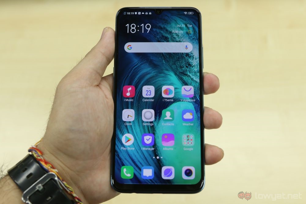
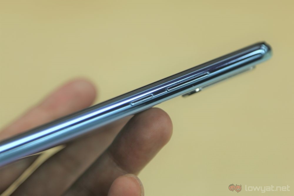
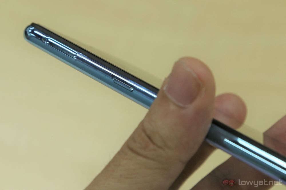
As with most setups these days, the power button and volume rocker sit on the right side. And on the left, we have another button that calls up the Google Assistant. It’s a familiar feature that we’ve seen on the V15 Pro before, and like before. Above it is the triple-slot SIM tray, which takes in two Nano-SIMs as well as a microSD card.
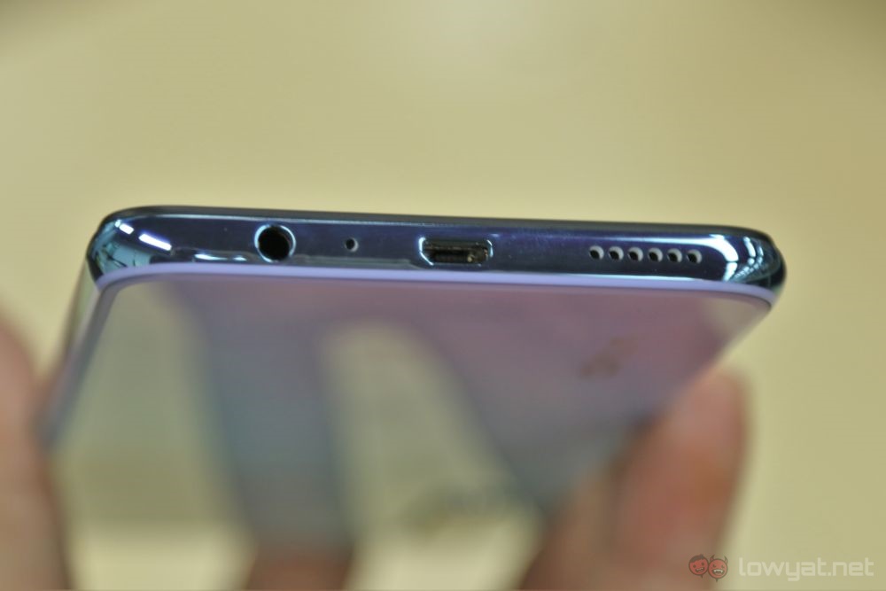
Going to the bottom, we have the Micro-USB charging port, the speaker grille, and the 3.5mm audio jack. In recent days, just seeing the thing makes me sigh in relief. The top of the phone is clean and plain.
The sides in general is a fingerprint magnet, to say the least. If you’re a neat freak, you’ll either want to always have a piece of cloth to wipe them off, or use the provided soft case.
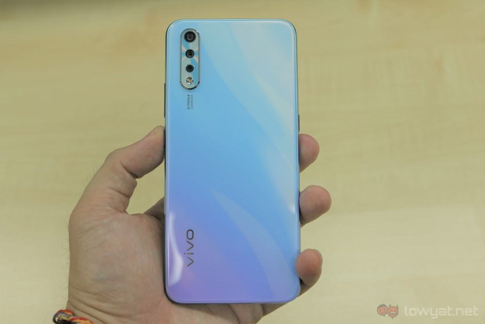
The back of the phone is actually pretty pleasant to look at. Vivo has also added an interesting effect to the way light is reflected, resulting in a wave-like pattern. Unfortunately, this effect is less visible if you do indeed use the soft case. That said, it’s better to keep the phone clean and safe should an accident happen.
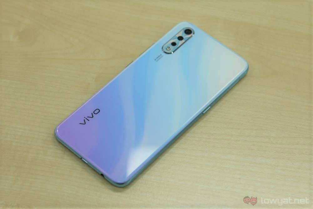
While we’re on the back, you’ll also see the Vivo branding at the lower left corner. The triple-camera setup, on the other hand, sits on the top left. The camera bump is here again, but if you don’t like it you can just pop the case on.
The user interface is basically what you’d expect from Vivo’s Funtouch overlay. It’s snappy enough, but it lacks an app drawer, which can make organising your apps a bit of a job. The speakers work well enough in a quiet setting, but you’ll definitely feel that it’s inadequate in public areas.
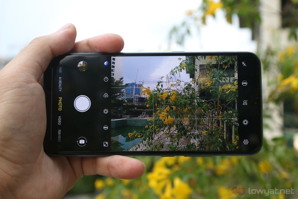
The camera comes with plenty of tools, most of which you come to expect in phones of today. You have the manual, panorama and portrait modes, as well as HDR. Photos are not bad, with passable colour aaccuracy and detail retention.
Overall, the Vivo S1 looks to be quite the competitive phone for its price bracket. The only question that really needs to be answered is its battery life, but that will have to wait for a full review.
The post Vivo S1 Hands-On: Another Strong Contender For The Mid-Range Market appeared first on Lowyat.NET.
from Lowyat.NET https://ift.tt/2SDURPg
Labels: Lowyat
0 Comments:
Post a Comment
Subscribe to Post Comments [Atom]
<< Home