Realme 3 Pro Hands-On: Taking The Place Of Its Predecessor
It was about two months ago when the Realme 3 was launched. You’d think that it’s a pretty short period of time between phone launches. But here we are, with the Realme 3 Pro. Naturally, the obvious thing to do was to take a moment to get a feel for what it’s like.
On the face of it, the Realme 3 Pro is very similar to the standard Realme 3, at least on the outside. It comes with the exact same form factor, with its 6.2-inch display. The dewdrop notch is very familiar as well, as is the very obvious earpiece. One notable difference here is that this is a Full HD+ display, as opposed to the HD+ display on the Realme 3.

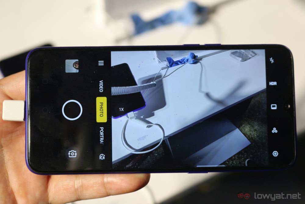
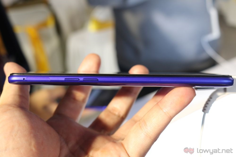
The sides are rounded and the phone itself has the right kind of heft to it. This combination makes the Realme 3 Pro very comfortable to hold and operate with one hand for long periods of time. Like before, the power buttons sits on the right, while the volume rocker can be found on the left.

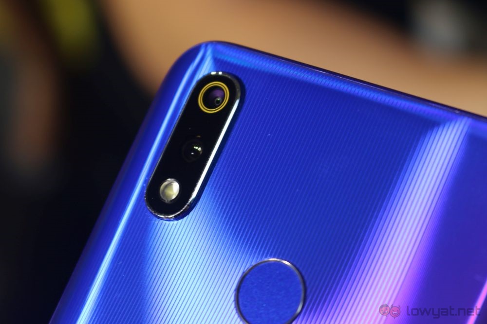
It’s much the same story round the back. The fingerprint sensor sits slightly above the middle, and two-camera setup sits at the top left corner. The main unit even has the same rings around it as the Realme 3 did.
What is clearly different is the way Realme chose to colour the phone. Rather than a gradient two-tone that the Realme 3 had, the Realme 3 Pro instead features a solid colour, with interesting curved lines on the back. That said, the lines are pretty subtle, and will barely be noticable most of the time.
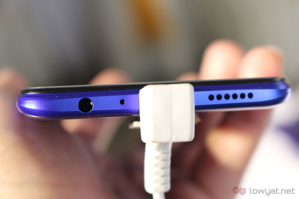
Another minor difference is the position of the 3.5mm audio jack and the speaker grille. These have swapped spots on the Realme 3 Pro, so now you get the 3.5mm audio jack on the left while the mono speaker is on the right. In the middle is still the Micro-USB port, for better or worse.
In use, the Realme 3 Pro is very snappy and responsive. Scrolling through from page to page is quick, and colours are accurate for the most part. The Realme 3 Pro’s screen brightness can also be turned up so high that it hurts your eyes, but its automatic brightness keeps it at the right levels very accurately.
On the volume department, the Realme 3 Pro wasn’t as impressive as the previous generation’s Pro variant. That said, it’s not an accurate assessment on my part here considering the surroundings.

On to the camera, you get the usual tools like panorama, time-lapse and manual shooting modes, as well as the Ultra HD super sampling mode. That last one can only be accessed from manual mode, for some reason. But overall, the Realme 3 Pro shoots surprisingly good photos, with accurate colours and a lot of details.
The Realme 3 Pro looks like a very interesting phone, set to repeat what the Realme 2 Pro did a year before. That said, we’ll need an in-depth review to see if that’s really the case.
The post Realme 3 Pro Hands-On: Taking The Place Of Its Predecessor appeared first on Lowyat.NET.
from Lowyat.NET http://bit.ly/2WIXn7O
Labels: Lowyat
0 Comments:
Post a Comment
Subscribe to Post Comments [Atom]
<< Home