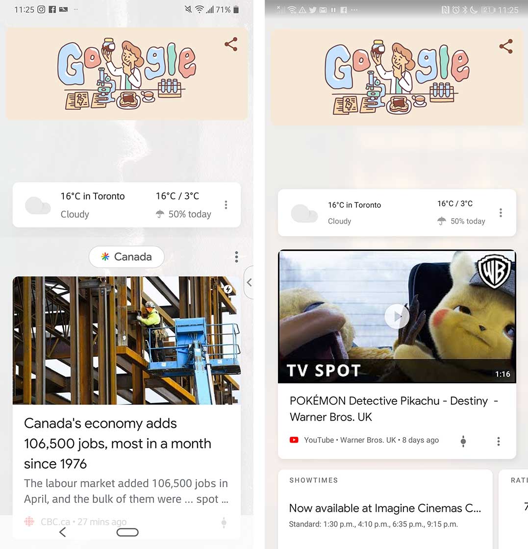
Google gets rid of topic bubbles in Discover feed redesign

Google’s new Discover feed design no longer has topic bubbles, and the feed now displays as a compressed list of articles.
The redesign does not have as much free space as it did with the topic bubbles, and now allows you to see more on the screen.

The downside: users can no longer easily access topic pages. Prior to the change, you could click on the bubbles and be able to explore a topic.
With the disappearance of the bubbles, users are unable to open topic pages. Although the topic still shows up on the menu, users cannot click on it to get to the desired topic page.
If Google wants to return this ability to users, the company may want to develop a new way for users to access topic pages.
The update was first visible in April, and users have reported seeing it recently. However, some devices may not be displaying the updated feed just yet.
Source: Android Police
The post Google gets rid of topic bubbles in Discover feed redesign appeared first on MobileSyrup.
from MobileSyrup http://bit.ly/2LB9lPN
Labels: MobileSyrup
0 Comments:
Post a Comment
Subscribe to Post Comments [Atom]
<< Home