Google Play Store gets refreshed look for ratings and reviews

Google started work on a Play Store redesign as far back as May. The piecemeal rollout of the new Material Design theme — characterized by heavy use of white — received a lukewarm reception.
However, the most recent change refreshed the ratings and reviews section of the app and received some praise from users.
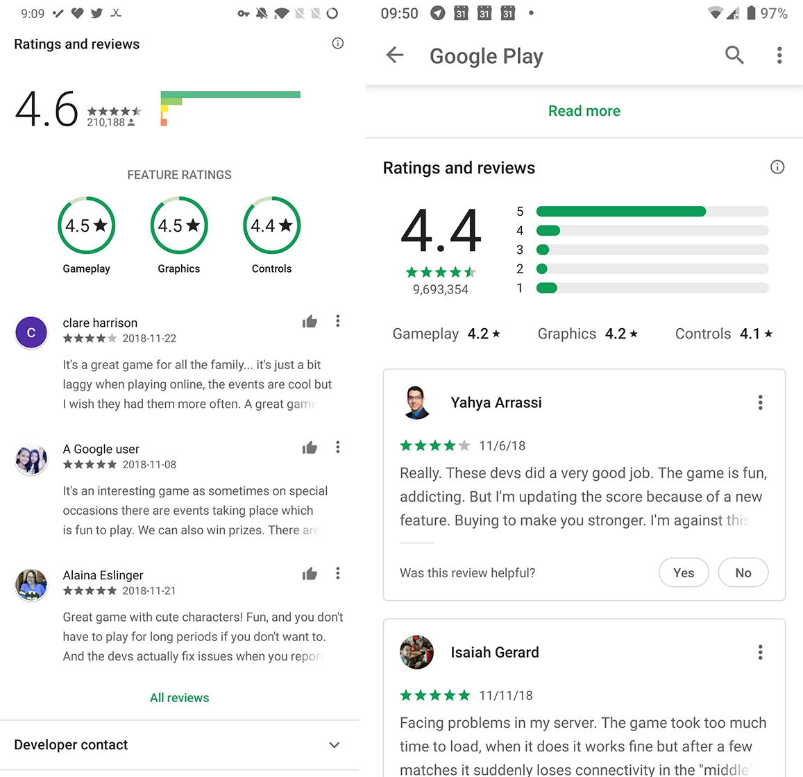
First and foremost, the visual refresh adds cards to the review section and rounds the buttons to fit with the new Material Design. Further, the graph breakdown that shows the number of reviews for each rating has a modern rounded look. Google removed several of the colours, opting instead to highlight essential areas with the familiar Google Play green.
I like the new look as it’s quite clean, but not all are fans.
Along with a visual refresh, the change makes it easier for users to filter reviews. For example, with a tap, users can sort reviews by star rating. There’s an option to filter by ‘key phrases’ as well, but at this time it appears to be an English-only feature.

Old reviews design (left) and new design (right)
The key phrases banner replaces the old circle system, which displayed three common topics mentioned in reviews, such as ‘Gameplay’ or ‘Controls.’
Overall, it seems like a relatively solid update. It appears it’s a server-side change, and may even be part of an A/B test. While that style of slow, piece-by-piece rollout with multiple rounds of testing can be frustrating, it’s ultimately for the best. Google Play is a vast platform used by almost every Android user. If Google broke something, it could be disastrous.
In this case, I’ll take the slow rollout over a catastrophic bug.
Source: Reddit Via: Android Police
The post Google Play Store gets refreshed look for ratings and reviews appeared first on MobileSyrup.
from MobileSyrup https://ift.tt/2KAdsaE
Labels: MobileSyrup
0 Comments:
Post a Comment
Subscribe to Post Comments [Atom]
<< Home