Google Photos website gets new Material Design update

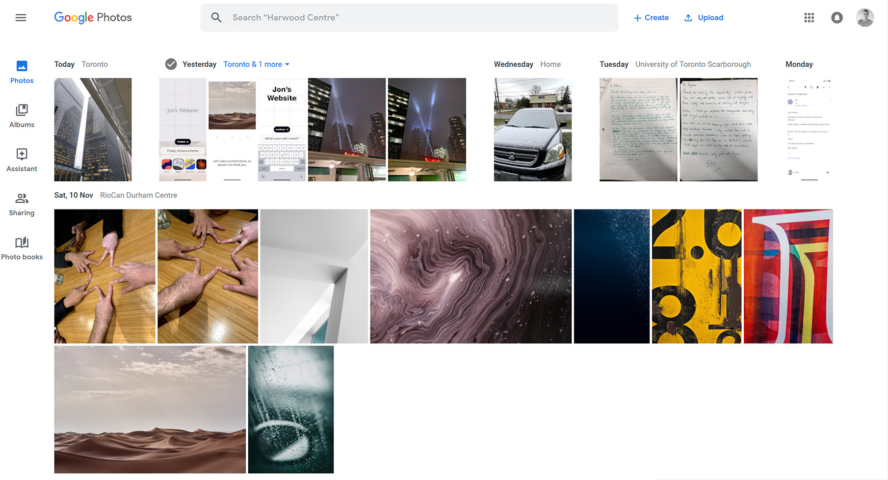
The Google Photos website has received the search giant’s new Material Design makeover, bringing it in line with mobile.
That means the Photos website now sports an all-white look with blue highlights, new fonts and more. Granted, the site already had a white background, so not much changed on that front.

The most significant difference over the old platform is the judicious use of Google’s Product Sans font. It seems just about everything has the font — the titles under albums, the search bar and plenty more. I must admit, I am a big fan of Google’s in-house font.
Further, the new icons look quite sharp. They’re not any different than what’s in the mobile app, but they look great nonetheless.
Additionally, the new look has rounded almost all the corners you can find in the app.

Beyond the visual change, nothing else seems to have changed on the Photos website. It’s just a plain old redesign — and a good looking one at that.
If you want to check out the new look for yourself, head over to photos.google.com.
Source: Photos Via: Android Police
The post Google Photos website gets new Material Design update appeared first on MobileSyrup.
from MobileSyrup https://ift.tt/2Dpaa8F
Labels: MobileSyrup
0 Comments:
Post a Comment
Subscribe to Post Comments [Atom]
<< Home