Google Keep is the next app to get Google’s modern Material Design

Google has been rolling out visual updates to its apps and services since the company showcased its Material Design when updating Gmail for the web back in April 2018.
Since then, most Android apps have received an update, and the web apps aren’t far behind. Google Keep is the search giant’s note-taking app, and it was in need of a facelift.
Android Police discovered the update in the 5.0.411 version APK file for Keep. Overall, the app functions the same as it did before, but visually it looks a little more modern and a cleaner.

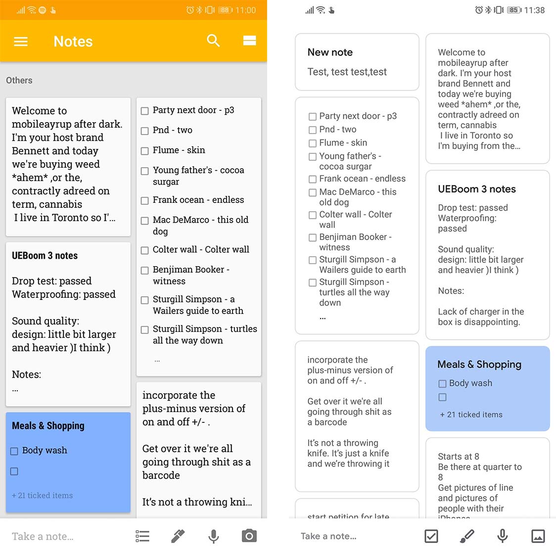
The old Android version of the Google Keep main screen on the left, and the modern version is on the right.
There’s a lot more whitespace in the redesign, the yellow from before has been desaturated and now signifies what page you’re on in the menu. Further, the whitespace makes coloured notes pop on the screen.
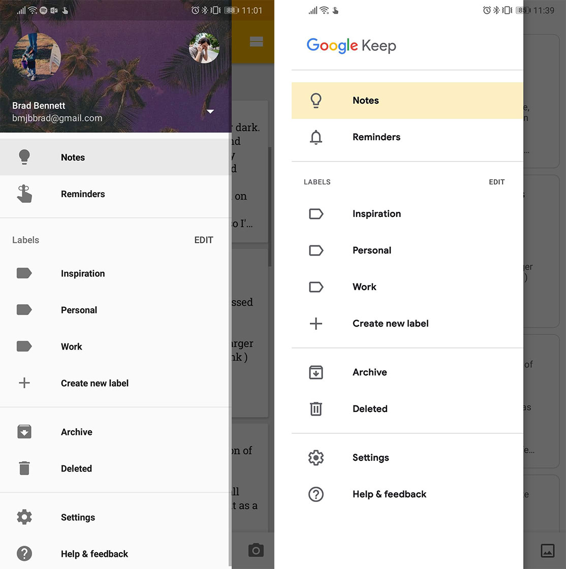
The notes now have rounded corners, and the apps icons are outlined to help it fit in with other updated apps. The side menu also got rid of the user’s profile information, so it looks quite a bit cleaner.

The old Android version of Google Keep’s side menu on the left, and the modern version is on the right.
The update is just skin deep, but it’s nice to see another app get graced with Google’s modern design.
To download the APK of the new Keep on Android check out APK Mirror, though as always, do this at your own risk. Ideally, this update should roll out soon since the official Play Store version is at 5.0.391.
Source: Android Police
The post Google Keep is the next app to get Google’s modern Material Design appeared first on MobileSyrup.
from MobileSyrup https://ift.tt/2NOJO1E
Labels: MobileSyrup
0 Comments:
Post a Comment
Subscribe to Post Comments [Atom]
<< Home