Fitbit Charge 3 Review: Solid improvement outdone by other products

The Charge 3, Fitbit’s newest entrant into its venerable tracker lineup, brings meaningful improvements to the line without spoiling the formula.
A refreshed design, improved screen and water resistance make the Charge 3 a contender for many people’s wrists — and for a good reason.
Fitbit’s software is as good as ever. Fitness tracking is accurate and informative. Checking in on your progress is simple and never demeaning. The tracker is welcoming and enthusiastically congratulates you when you complete your goals.
However, the Charge 3 isn’t perfect. One could argue that these improvements should have been on the Charge 2, and the software has its flaws.
All-in-all, the Charge 3 is iterative. While those iterations may bring features dedicated Fitbit users want, they might not be enough to justify its position just below the Versa.
Refreshed design
One of the most significant changes in the Charge 3 is the new frame. It ditches the stainless steel of the Charge 2 for an aerospace-grade aluminum frame that’s 20 percent lighter than previous models.
My review unit sported the graphite colour, which looks sharp without standing out. I’m not a fan of large, garish watches and the Charge 3 was ideal for me. It looked good on the wrist and didn’t clash with what I wore.
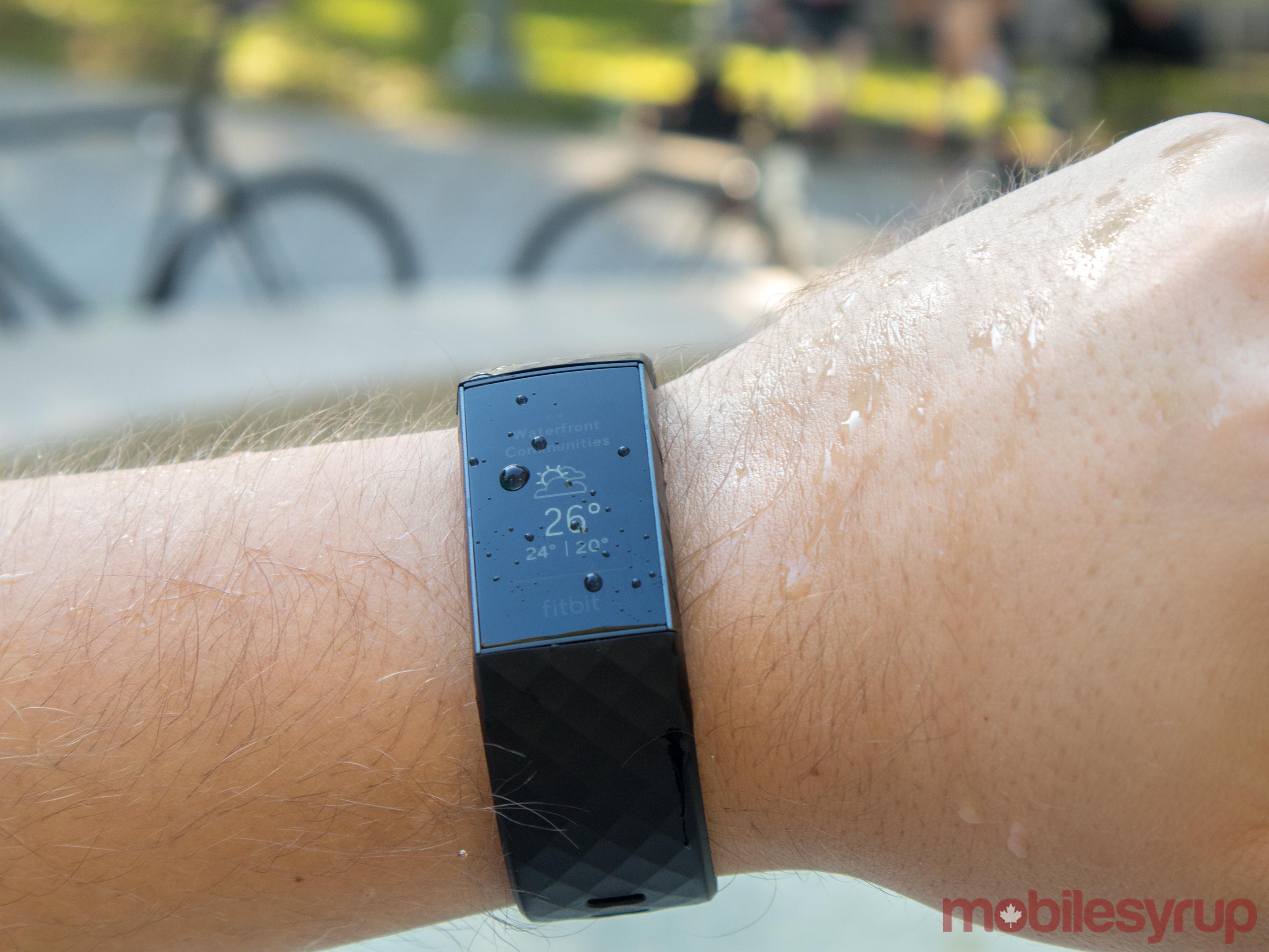
The new frame also brought a coveted feature to the Charge 3 — water resistance. Fitbit rates the device for up to 50 metres of depth in water.
Even for non-swimmers, it is a welcome addition. Water resistance gives a peace-of-mind when using the Charge 3. For me, I find wearing any piece of tech on my wrist a journey in paranoia. Watches and bands tended to get caught on things and smashed on walls and doors. They also get splashed when I wash my hands or cook. Water resistance gave me one less thing to worry about.
Part of the move to water resistance meant Fitbit had to abandon the traditional side button. However, the new ‘button’ is a more than adequate replacement.
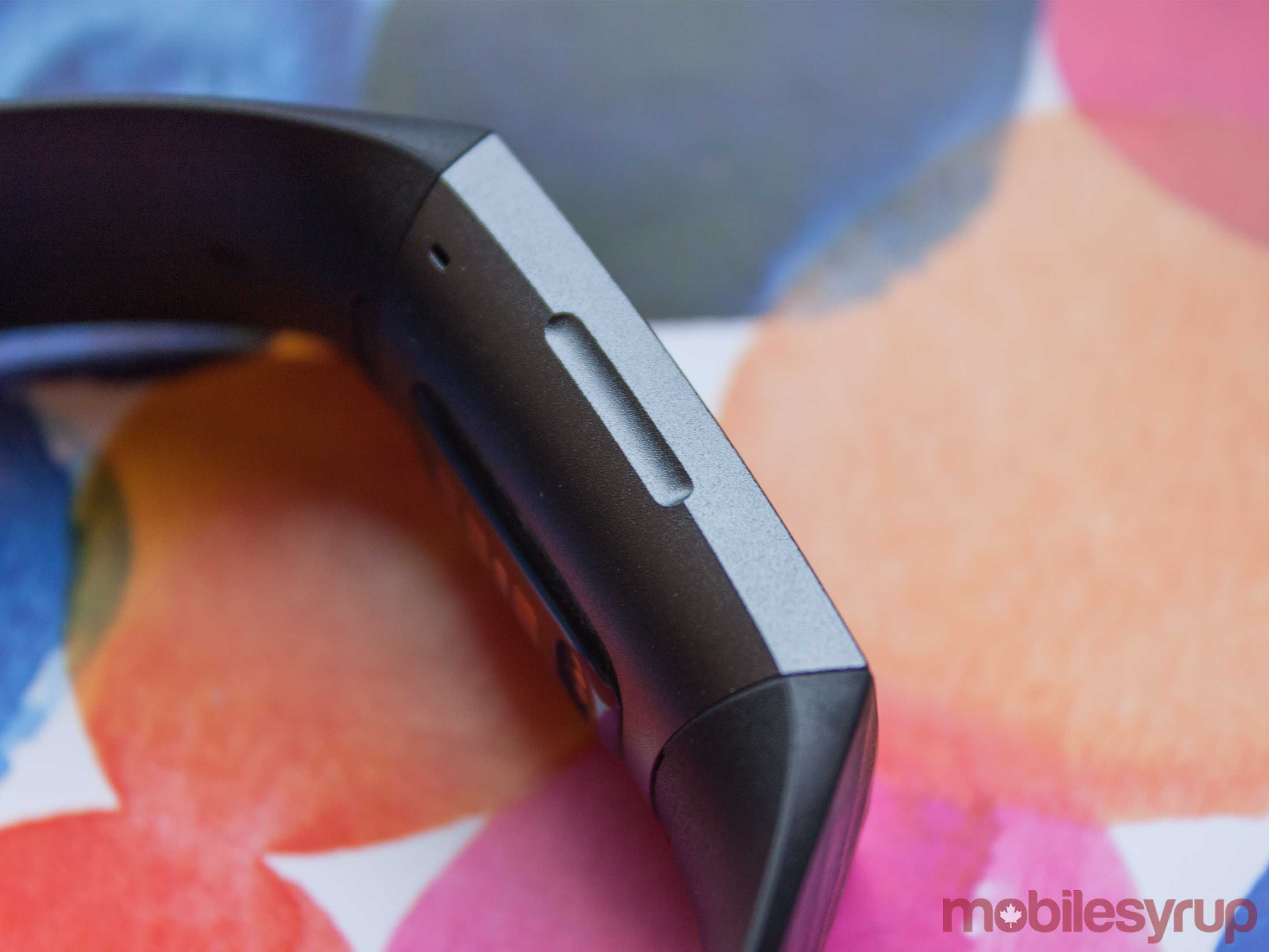 The inductive button works similarly to the home button on the iPhone 7 and 8. It has no moving parts — the only indication that there’s a button is a slight indent on the left side of the watch. When you press it, the device vibrates. Unfortunately, it isn’t like the haptic feedback in the iPhone. It doesn’t feel clicky, but the buzz is enough to let you know you’ve pressed the button.
While some might mourn the loss of a physical button, I found I didn’t miss it. Plus, pressing the side of the watch felt futuristic to a degree. As a trade-off for water resistance, I think it’s a no-brainer.
The 3 also sports a ‘classic’ Fitbit band — unless you go for the Special Edition which comes with a perforated band. I had the classic strap in black, which I found to be comfortable. However, it’s also quite stiff, which can make putting it on difficult at times. Thankfully, the excellent battery life means I haven’t had to take it off much.
The new clasp is aluminum as well. However, it feels slightly cheap and plasticky. Additionally, its shape contributes to the difficulty of putting on the device.
The bands also feature a simpler removal mechanism. On the inside of the strap, where it connects to the Fitbit, there’s a small button. It’s easy to click with your nail, and the strap pops off with ease. It’s a strong hold too, with no fear of it coming off by accident.
However, I noticed a large amount of dirt built up in the crevice between the band and the watch after almost a week of light use. I can only imagine that build-up gets significantly worse when coupled with more sweat-inducing activities.
New monochrome OLED display is about more than just taps

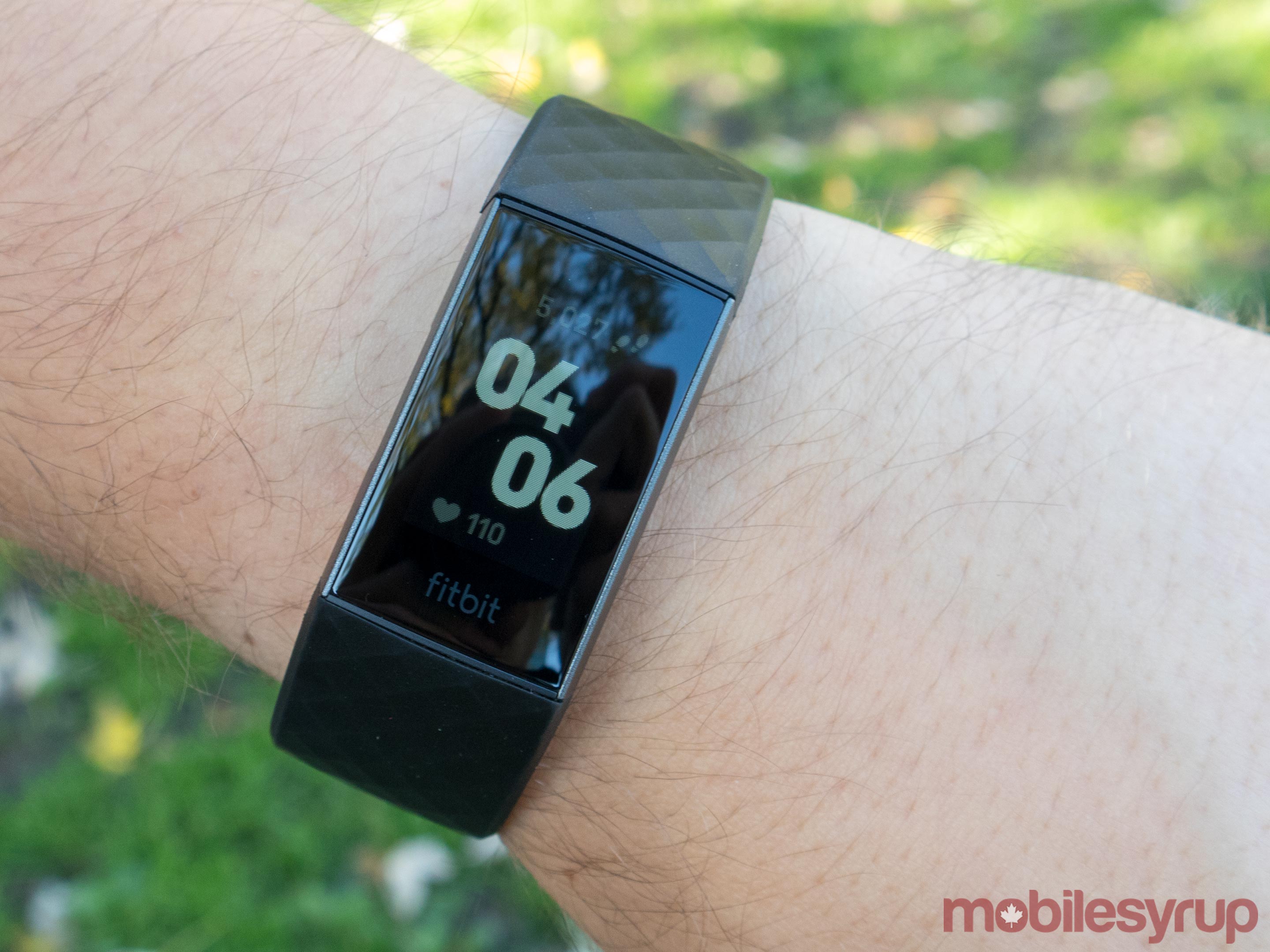
That fancy new frame encloses a new display. Fitbit says it offers 40 percent more active screen real estate than the Charge 2. Furthermore, Fitbit says it’s 40 percent brighter than before.
Along with more active screen area, the new screen is touch-based instead of tap-based. That means you can swipe around the various screens instead of tapping to cycle through them like the Charge 2. It makes using the watch more intuitive.
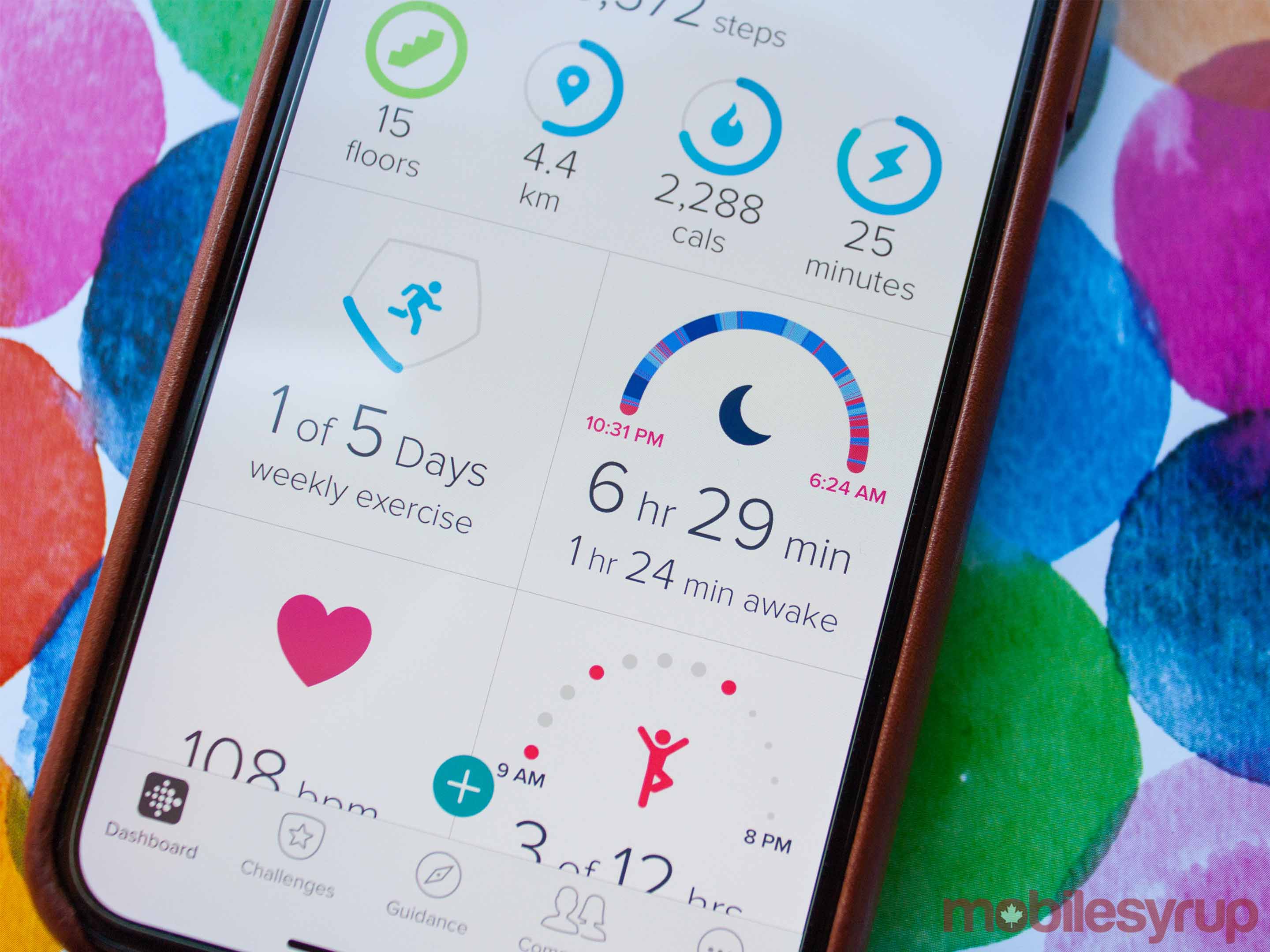
A tap on the watch — or a press of the inductive button — brings the OLED screen to life. Like the Charge 2, it’s monochrome. It’s also not the highest-res screen, but everything is still readable. The main screen shows the clock, your step count and your current heart rate.
Swiping up on the clock screen shows your current battery life, your steps, heart rate and plenty of other data the watch has collected. As you swipe through, you can see the distance you’ve walked, calories burned and more.
Pressing the inductive button takes you back to the main screen, where you can swipe down for notifications. I kept these turned off for the most part. While some may enjoy glancing at their wrist to see what’s happening on their phone, I found the vibrations to be too strong. With no way to disable vibrations, the feature was just too annoying to use. Settings allow users to set the vibration strength to ‘Normal’ or ‘Strong,’ but I found there was no discernable difference between the two.
To the right of the clock screen are three screens users can swipe through to access other features. Exercise guidance and the ‘Relax’ guided breathing is on the first panel. Another swipe brings timers and alarms. A third brings weather and settings.
As far as Fitbit’s claim that the display is 40 percent brighter, it undoubtedly is brighter. Too bright, in fact. Wearing the watch to bed was quite annoying.
The screen features an ‘auto-dim’ setting that supposedly reduces brightness at night or in the dark. However, I found it didn’t really work. At least, I couldn’t see a difference.
For a device designed to wear when sleeping, it is remarkably distracting. I tend to roll around a lot before settling to sleep, and motion causes the screen to light up. Even set to ‘dim,’ the screen was like a miniature sun on my wrist.
I ended up leaving it on dim for the entirety of my time with the Charge 3. It never hampered my ability to view the watch outdoors.
Not all about the externals
Beyond fancy new displays and frames, the Charge 3 features new internals too.
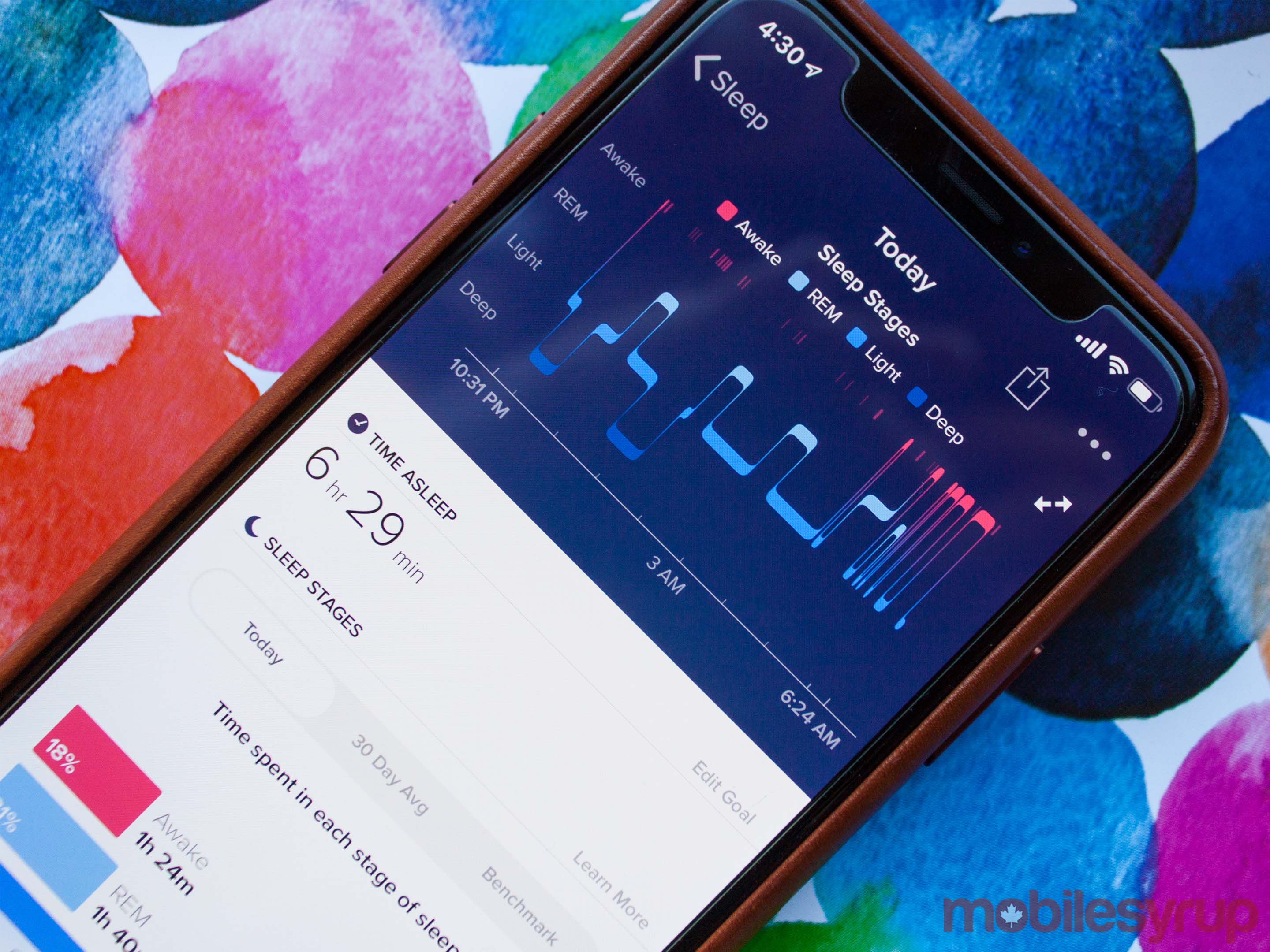
For one, a new Sp02 sensor, which comes from the Ionic and Versa smartwatches, enables a new ‘Sleep Score’ functionality on the watch.
This makes it easier to see details about your sleep patterns and determine how you can improve your sleep.
Along with the new sensor, there’s an NFC chip as well — if you get the more expensive Special Edition. The NFC chip enables Fitbit’s Pay solution so you can tap with your wrist.
However, Fitbit Pay is still relatively limited in Canada, with support for only ATB Financial and Brim Financial (through Mastercard) and RBC Royal Bank credit cards.
Tracking is improved and expanded as well, with new options like a ‘female health’ tracker that provides information related to menstrual cycles on the wearable.
Fitbit’s tracking is robust — why can’t I share that data?
Fitbit’s software solution is quite good and offers plenty of useful options. Nothing has significantly changed since the Charge 2 came out — it’s still the simple dashboard that gives you quick access to common and vital stats.
Furthermore, Fitbit partners with plenty of great third-party apps to bring in more data to aid in fitness tracking. For example, you can connect apps like MyFitnessPal to feed nutritional data and calorie intake into Fitbit. This helps Fitbit suggest workouts and guide your fitness goals based on your diet.
However, Fitbit refuses to partner with two essential apps — Apple Health and Google Fit.
For me, being able to sync data to, and more importantly from, Apple Health and Google Fit would improve my experience with Fitbit exponentially.
Before using the Charge 3, I had a Nokia Steel fitness tracker and a Nokia smart scale to go with it. As much as I enjoyed the Steel, I found that I enjoyed the extra features in the Charge 3 and was ready to switch over permanently.
However, I don’t want to upgrade my scale yet. Nokia’s health app works with Apple Health and Google Fit, meaning I can sync my weight data from Nokia with those apps. But Fitbit’s lack of compatibility with those platforms meant I couldn’t pull the data to the Fitbit app.
While it makes sense from a business perspective — Fitbit makes smart scales too — it’s incredibly aggravating as a user. It’s my data, and I should be able to sync it with the platforms that I want.
Some photography by Bradley Bennett.
The post Fitbit Charge 3 Review: Solid improvement outdone by other products appeared first on MobileSyrup.
from MobileSyrup https://ift.tt/2pRxYKw
Labels: MobileSyrup

0 Comments:
Post a Comment
Subscribe to Post Comments [Atom]
<< Home