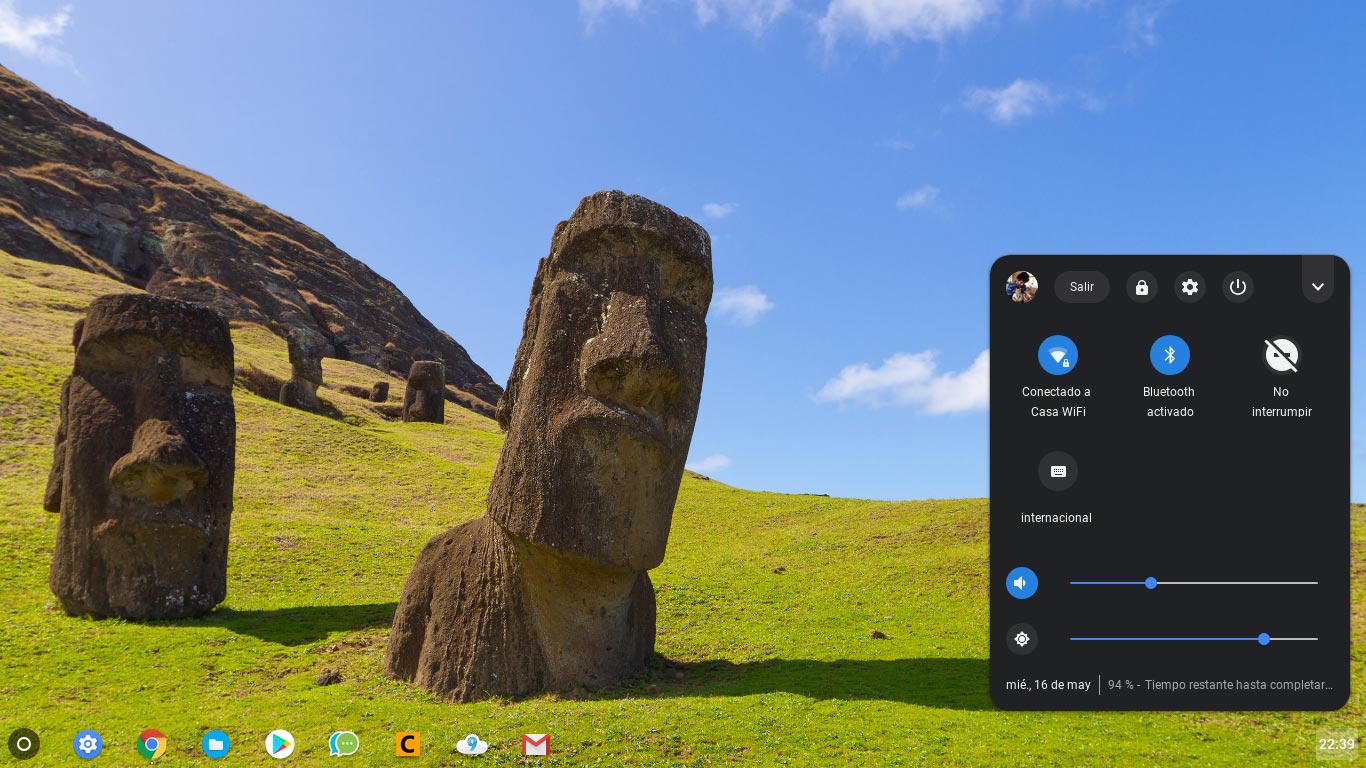
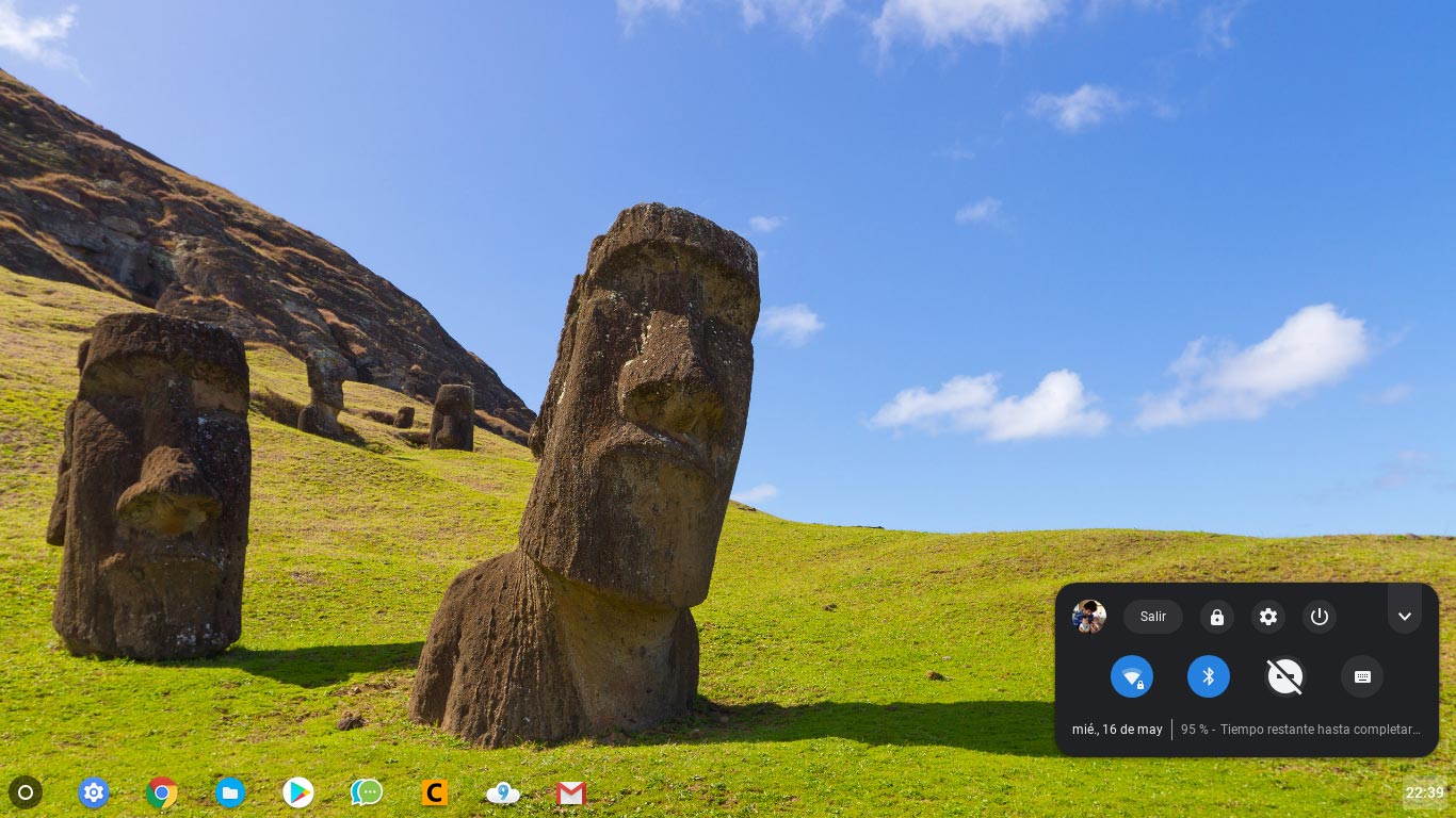
Chrome OS dark mode system tray is getting closer to its final build

The Android P-esque dark mode system tray is coming to Chrome OS.
A Reddit user named r/JebusCL has found that in the Chrome OS developer preview and some beta builds of the operating system, there is now a dark themed system tray.

The tray looks similar to the Android P notifications shade with hints of blue and white buttons. There’s also a new function that will let users shrink the tray just like how Android notifications have a condensed and expanded state.
To enable this colour scheme, users in the Chrome OS beta channel need to activate the ‘#enable-system-tray-unified’ flag. To turn on the flag simply search ‘chrome://flags’ in your browser and then turn on the specific flag.
There are a few other tags to activate as well. The ‘#enable-message-center-new-style-notification’ and ‘#enable-new-app-menu-icon’ should make Chrome OS look a bit different as well.
Dark mode has been featured in some versions of Chrome Developer channels since February.
Image credit: Reddit
Source: Reddit Via: Android Police
The post Chrome OS dark mode system tray is getting closer to its final build appeared first on MobileSyrup.
from MobileSyrup https://ift.tt/2KzUQGG
Labels: MobileSyrup
0 Comments:
Post a Comment
Subscribe to Post Comments [Atom]
<< Home